If you’re a mom and into fashion, you’ve probably heard of The Mom Edit by now and if you haven’t yet, well, you’re missing out. I’ve mentioned my love for Shana, the site’s creator, before and shared some of the art collaborations we have done together for The Mom Edit. Last month, we were talking about what direction we should head in this year for our monthly art/style collaborations when Shana suggested doing a mini shoot featuring both my style and my art. We were already at the beach, and a few glasses deep into our bottle of white wine so we figured why the heck not?! And then last night I got a text from my best friend who said she just spotted my feature on The Mom Edit, so I thought I would share some of the photos here too!
Hi everyone, this is my first attempt at creating wallpaper designs of my own, using my own art. .This has definitely been a learning experience for me, the wide world of graphic designing is a bit overwhelming but I figure, I have to start somewhere.
I did three different designs and made two different pixel size versions of each….there are so many different display screen sizes out there (including the screen on the mockup photo I used…I still don’t know what size that is supposed to be) so if any of the sizes don’t fit for your screen, feel free to email me at thiswildpreciouslifeblog@gmail.com and I will add one for you.
My next task is to figure out how to link a google doc or dropbox account directly to my blog so you can download from there but for now, just click on each individual image to save the wallpaper designs to your computer.
She is an architect and urban designer with a passion for vibrant colors and a sense of style that is one of a kind. I first discovered her via Instagram @monlinglee fell instantly in love with every single one of her photos. She combines her unique and brilliantly colored personal style in perfectly coordinated urban environments.
By following her instagram account, I found out that she was teaming up with J. Crew to “Test-drive” Their new spring accessories on their blog: hello.jcrew.com. And was inspired to try to create my own color blocked outfit with my skirt I bought for a penny at Nordstroms Rack. JCrew and Monling Lee are having an instagram contest on how where you wear (and pair, and pile on) your J.Crew accessories with the hashtags #ACCESSORYFIX and #JCREWCONTEST for a chance to win one of three $1,500 shopping sprees. And although I don’t have a new spring accessory to actually join in…here are my outfits:
I put together a little Holiday Themed Art Journal Idea List, some of the ideas are a bit simple but fun.
I always find myself journaling and sketching a lot over the Christmas and New Years breaks. I think it’s my way of reflecting on everything that happened over the past year as well as gearing up for the new year ahead (also because I usually like to start the new new calendar year off with a fresh journal so I try to fill up the remaining pages in the old one). Also, I am one of those people who religiously comes up with New Years Resolutions every year…The older I get, the more it’s becoming a bucket list and a reminder for me that life is moving fast. I am a big list person too…I just feel better about my lack of organizational skills when I can cross off even the most mundane tasks.
I also rounded up some of my favorite journal pages from this year….they are nothing like some of the pages I see of other artists on pinterest or tumblr…but they make me happy 🙂 Some of them can fit as examples for the Winter themed list so Ill note them if they do…
e e cummings mixed media art journal collage page
One of my favorite things to do is write down inspiring quotes, passages, poems r song lyrics I come across and then create some sort of art around it.
ink and mixed media watercolor shape collage with quotewatercolor flower bouquet and vasesucculent and cacti plantersfloral watercolor artist sketchbook page
I can’t help that my natural artistic impulses are the same as every 2 year old who has just been given their first ever box of crayons (to take all the colors, smash them together, color all the paper, mess all over the floor and then take a nap curled up in the eye of the hurricane). I swear I have every intention of trying to become a decent artist when I get out my graphite pencils and little eraser to practice sketching. Somehow though, I always end up on the floor surrounded by paint in every color and shade available. But Im at my happiest and most inspired making my kaleidoscopic messes…
I happened to spot the inspiration for this DIY art project in an advertisement in House Beautiful magazine for minted.com. I ripped it right out (don’t worry, it was my copy!) , taped it to my wall and started to go to work on my own version. Later, I was able to investigate further and discovered (thank you pinterest) that the Artist’s is Yao Cheng, she specials in beautiful watercolor paintings and her online store on Minted’s website is FULL of stunning watercolor prints. The above piece and the object of inspiration is “Hexagon Cluster,” and you can purchase her Limited Edition of Hexagon Cluster print on Minted (or click through the links) for anywhere from $20 to $200 depending on size and finish.
Here is everything you will need to make it:
1) watercolor paints (the Kids Crayola watercolors work just fine) and paper (brushes and cups of water as well)
I suggest the following liquid watercolors for bright, vibrant colors:
Sargent Art 8-Ounce Watercolor Magic Set (10 different watercolors for $49.95)
click on picture to view in Amazon
or Dr. Phil’s Concentrated Watercolors (my personal favorites) They average about $5.00 a bottle or a set of 14 is around $69.99.
Dr Phil’s Concentrated Watercolors (click pic to view in Amazon)
2) Watercolor Paper Pad
For the best price and quality, I suggest Strathmore 360900 Cold Press 140-Pound 12-Sheets Strathmore Watercolor Paper Pad, 9-Inch by 12-Inch, which is only around $7.00, also available on Amazon:
Click photo to purchase in Amazon
3) Thick, heavyweight white paper Mixed Media paper works well, just something to hold the weight of mixed media and glue without tapering.
4) Scissors and a gluestick!
The How To:
The steps to making this DIY project are super simple. But since I’m not sure of how the original artist created her stunning piece so I’ll tell you how I made my version.
1) Get out your watercolors and watercolor paper and go crazy (this is one of my favorite things in the world to do). You don’t need any fancy paper or expensive watercolors. In fact, I mostly used plain old, reliable Crayola Washable Watercolors (available in probably every single pharmacy and grocery store in America). because I had just moved to Grand Rapids from Chicago when I got this project itch, I had none of my supplies and couldn’t wait a few days till I went home again.
* Try experimenting with colors…I love playing with colors and mixing and matching up colors I wouldn’t usually put together while doing this…I tend to lean towards bright, bold, colors but what I love about Cheng’s is that she uses subtle, subdued colors with a pop of bold color that makes the piece stand out. Her use of subtle tones and light/grey hues accentuates the rich blues and the subtle use of warm orange colors all come together to create a vibrant, yet refreshingly simple and peaceful piece of art that would compliment many differently styled rooms.
2) Using a ruler or something to help you draw straight lines, trace out 20-30 hexagons (6 sided shapes). Make sure to make all different sized hexagons..the sides don’t necessarily have to be symmetrical or have all equal lengths..this will help to add to the abstract and organic feeling of the piece.
3) Arrange them in a way you like on your heavyweight art board..the only rule I used for myself was that each shape has to be touching another shape by at least one point..I think this helps adds continuity and fluidity of the artwork and helps guide the viewer’s eye from each unique hexagon to the next.
I also tried another technique and did one piece where all the sides of the shapes had to be touching sides perfectly..this one took a little more time and a lot of cutting down shapes to fit better…
4) admire, frame and hang!
Here are a few that I did, as you can see, I have a hard time using natural and subtle colors- which I think makes my finished pieces a little to “in your face.” But to each their own!
See what I did there…With the title? Yeah, I need to get out more. Before I start in to my epic blue hair adventures, I just want to thank all of my friends, family and anyone else out there who read my last blog post: “Blessed are The Cracked…” I struggled with posting it for a long time, as it went deeper than I usually go.
But when I posted a link to the article on my Facebook page (in an outright act of shameless self-promotion, and deleted it twice before I left it there) I was so blown away by everyones kind words and encouragement. I was walking around glowing for the entire day and it was such a boost in confidence that Im surprised I didn’t sprout peacock feathers out my bum! So thanks again.
Anyways, onto my latest mishap.
so this happened…
blue hair, don’t care (but kind of do!)
I have been toying with the idea of dying my hair some crazy color for awhile now…and as a lot of my more hair-brained (pun intended) ideas begin, I was up reeeaaally late on pinterest where I created a board just for my crazy hair color inspirations and pinning away.
Now, I will be the first to tell you, that I get quickly excited about ideas and don’t always think my them through. I just get caught up in the moment and fail to think clearly.
I convinced myself that I was mentally prepared to dye my hair because I went so far as to create a profile on Taaz.com (a website where you can try out different hair styles and make up using pictures of yourself). My idea of “thinking this through” was to upload a picture and try out some different hair styles. I promptly found and tried the only blue hair color style available, (on the gorgeous katy Perry). This is the picture they had:
Katy Perry’s blue hair
Gorgeous right? Yeah. Aaaaaaand well, here is how mine turned out….just in case you haven’t laughed today…
hahahahaha
Me and Katy are practically twins! But really, the website was actually really great and these “virtual makeover” websites have come a long way in the years since they first came out and I did it in high school, a good 15 years ago (and I am glad those photos can never be unearthed). Taaz.com, allowed you to contour the hair style to fit better onto your head (as my head is huge and round like a basketball). but I wasn’t done yet! so my next step was to download a free iPhone app called Make With Beauty that allowed me to take a picture of myself and change the color of my hair already. I couldn’t figure out how manipulate the hair color effectively in the app and my hair always ended up looking like it would glow in the dark. but the idea was to see what I would look like with a lighter shade of blue:
Looks like I dipped my head in some radioactive goo…A little to neon/glow in the dark for me- but still closer to what I wanted.
so by now I was getting pretty pumped up about the idea…Maybe a little too excited because following morning, I woke up and went straight to Ulta, where I hastily picked up a bottle of Jerome Russell’s Punky Colour in turquoise for only $9.99.
And here is when things get sketchy…
in my haste/over-excitement… I didn’t read the directions or the label completely and carefully and what I thought was NON permanent was actually SEMI- Permanent (the back says 5-40 washes).Which is a problem because I needed my hair to be back to a natural blonde hair color by the following week for work.
The directions said to leave it in your hair for 20-40 minutes and since I wanted a lighter color of blue (that would wash out quickly) I left it in for only 15 minutes. Little did I know that my hair was the PERFECT type (damaged, bleached, blonde, dry) to absorb and hang on to allll of the turquoise color.
After I washed out the hair dye, I took a look in the mirror and spent the next few hours washing my hair over and over in a blue blur of anxiety attacks and hyper-ventilating. I called out for help from friends on Facebook and Instagram, and read several articles for home hair color lifter remedies (I wasn’t close t0 being able to leave the house). With friends help and a great article on Wikihow (which I highly suggest looking at if you find yourself in the same position as I did) I tried all sorts of home remedies: soaking my hair in crushed vitamin C tablets, adding dish soap to my shampoo, adding laundry detergent to my shampoo, , adding baking soda to dandruff shampoo and again washing. These helped to lighten the color somewhat but left me with a new and even scarier problem: severe hair breakage!
It was during my cry for help from my friends on social media that my old college roommate introduced me to the amazing Alison and her blog The Alison Show. She had also dyed her hair a similar color, although she went the preferable route: to a hair stylist. She was so kind and reached out to me and said that she too freaked out when she first saw her hair in the mirror but that it washed out so quickly that she wished it had stayed longer.
After 48 hours of locking myself in my house and washing my hair over 10 times, I had resigned myself to my immediate future as a blue-headed smurf.
Within a few days I ended up really liking my mermaid hair and wishing I could keep it longer,
So here are some of my tips for if you want to dye your hair blue, green, pink or any other fabulous combination:
1) always READ THE LABEL carefully!
2) Before doing a semi-permanant or permanent color try something that will wash out in 2 to 3 washes such as:
3) Try out different styles using a smart phone app or Taaz.com
4) Be emotionally prepared!
5) Consider the damage level that any hair dye does to your hair
have fun and dye away. If you have any pictures or stories about your wild hair dye adventures, feel free to email me at ourwildpreciouslives@gmail.com with pictures and your story and I will share it!
Happy Memorial Day weekend everyone! Be safe and have fun!
The Dot by Peter H. Reynolds is not only one of my favorite childrens’ books, but it is also one of my personal favorites. As a teacher and an artist, I find it incredibly inspiring for both children and adults. The Dot is a story about a little girl named Vashti who doesn’t have much faith in her self as an artist. One day at the end of art class, Vashti has yet to draw anything but her art teacher encourages Vashti to “make a mark, and see where it takes you.” Frustrated and annoyed, Vashti slams her pen down on the paper creating a small, single dot.” Her art teacher sees something more than just a black dot and Vashti comes to art class next week to find her dot framed in gilded gold and hanging behind the teacher’s desk. This sparks Vasthi’s creativity and her belief in herself. From there on out, Vasthi can’t be stopped!
I love it because it inspires the reader into believing in themselves. So, for the last art class, I read the book at the beginning of the class to the students and then let them go crazy with markers and pens. They took their assignment very seriously and came up with some beautiful and unique “Dots”:
I was so impressed with how much they loved the book and how excited they were to do this activity. If you need a filler or an opener for an art class, I would def. recommend it. Just read the book, and let your kids go crazy with blank paper and markers.
Also, worth reading to your kids is Ish also by Peter H. Reynolds, and it has the same sort of artistic inspirational message. Reynolds has a great website that is full of ideas and activities. He also answers questions from students: http://www.peterhreynolds.com/dot/
And of course…I had to do some of my own Dot inspired artwork:
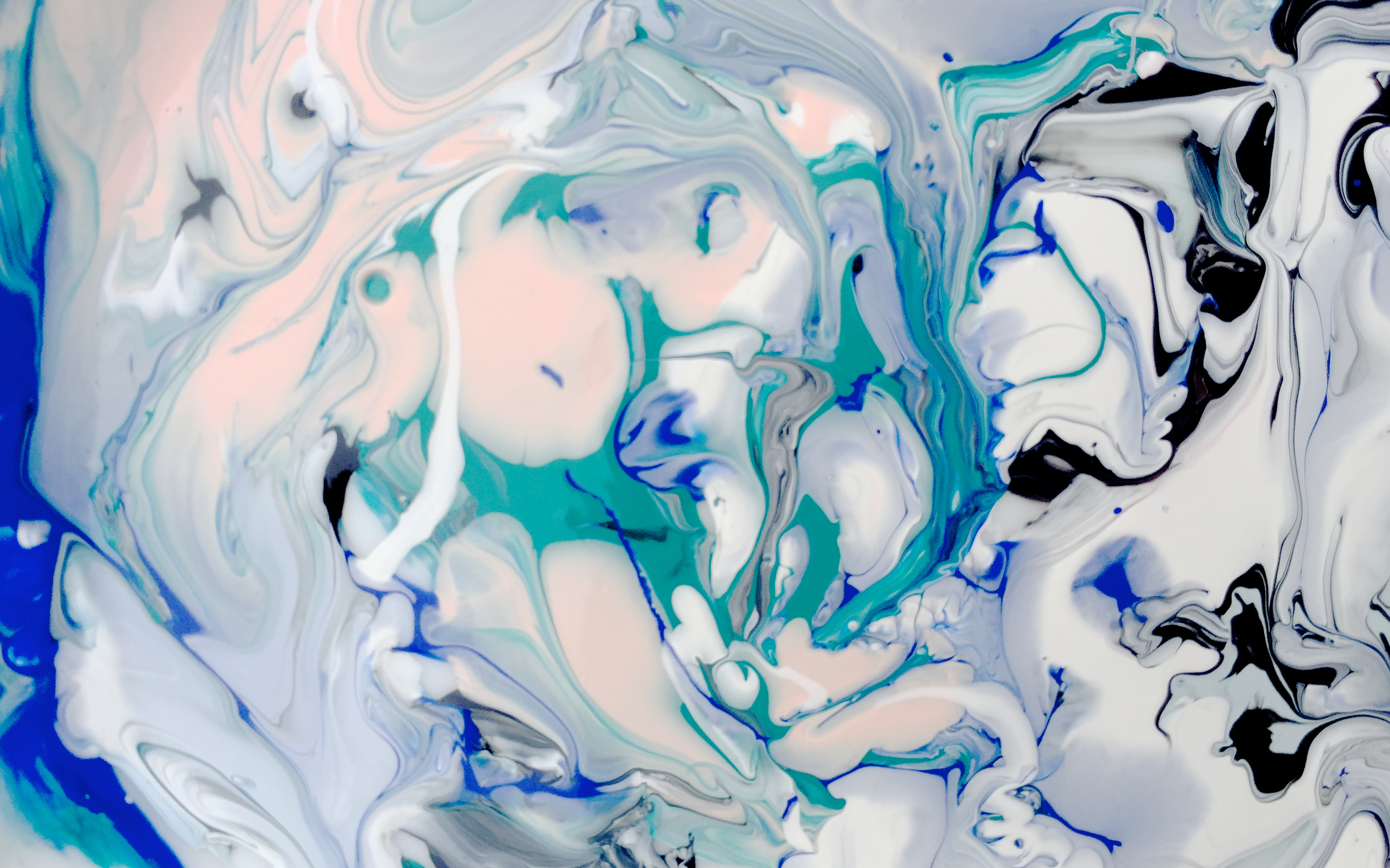
So, I’ve started my after-school art class at the elementary school where I teach. At first, I was nervously checking the office for completed registration forms and worried I wouldn’t have enough students BUT lo, and behold, I reached my limit of 20 students and went past it, ending up with 24 students in 2nd-4th grade! In our first class, students created their own art journals using the “colorfield” technique of abstract painting and canvas. I found this lesson on Dick Blick’s website. Here is the link: http://www.dickblick.com/lesson-plans/color-field-sketchbook/ The finished art journals should end up looking something like this:
The kids LOVED making their journals but it was a little messy. I spent a good two hours after they left scrubbing the paint from the tables, stools, and floor. So, just wanted to CAUTION you if you plan on doing this with kids (or even if you do it for yourself) you will need LOTS of old newspaper, or trash bags, and paper towels.
So, how to make these lovely journals you ask? All you need are various colors of acrylic paints, unprimed canvas, plastic cups, an empty spray bottle and some paint brushes.
* For each color you want to use, squirt about tablespoon of paint into a disposable cup and then put about a tablespoon of water in the cup (less water for darker colors) and mix with a paintbrush until smooth. Choose 3 or 4 colors you want to use (remember that mixing more than 3 colors together in one place will create a brownish blah color)
* Fill the spray bottle with water and spray sections of your canvas (this will help create the swirly patterns when the colors mix together with the water and the dry canvas).
* Pour onto the canvas!
Experiment with different colors and different “pouring techniques.” Try pouring from far away, to create a splash pattern. Use a paintbrush to flick a spatter pattern, or pour colors, then tip the canvas up, so that the colors create a “raindrop” or “drip” pattern.
* Be careful of using too much water, or pouring too much, because it will pool on the canvas and mix with all the other colors to create an unpleasant brownish color.
I spent way to much time on mine…I used a lot of white paint, because I found that it brightened the colors and kept it from becoming to dark. Here’s how mine turned out….I am sure if I was to make another one, it would be completely different.
I think next time, I want to try a more simple approach; using only 2 or 3 colors and not worrying so much if there was blank canvas.
These are just a few of the outcomes from my students..I love how unique and colorful they all turned out. I can see their individual personalities in the colors they used and how they mixed them:
a new idea I had the other night when I was watching What About Bob…(my favorite movie) and thinking of how I feel like sometimes I am Bob Wiley and my husband is Dr. Leo Marvin.
and it just kept going from there….
you are the milo to my otis.
you are the fraggle to my rock.
you are the elliott to my e.t. (can you tell I grew up in the late 80’s/early 90s?)


