“I felt my lungs inflate with the onrush of scenery – air, mountains, trees, people. I thought, ‘This is what it is to be happy.'”
– Sylvia Plath, The Bell Jar
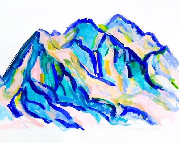
It’s good to finally feel that spark of fresh artistic inspiration like I finally felt when I started painting mountains. The most frustrating times for me is when the desire is there to create, but nothing feels inspired.It’s those heart thumping, urgent, fully focused artistic moments that are what I live for. When I’m completely absorbed in a project and it stops being about perfecting a final product (something that insures I am bound to be disappointed and zaps me of desire) and more about personal expression.
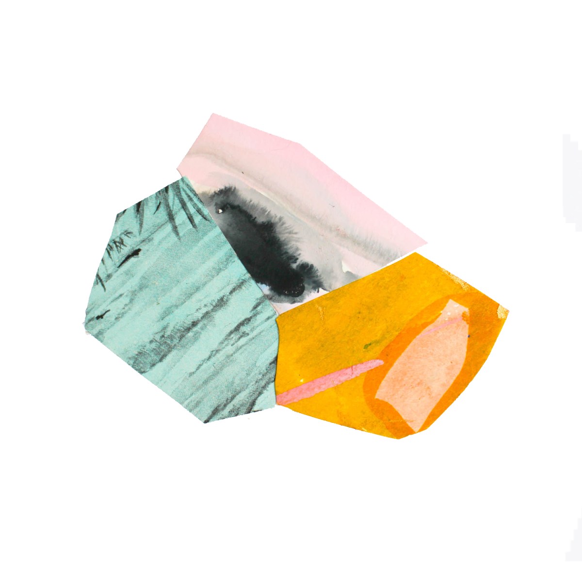
Cutting up pieces of my abstract paintings into polygon (ish) shapes and then creating collages is one of my favorite ways of creating art. I love mixing and matching colors that I wouldn’t usually think to put together- although, sometimes my OCD kicks in and I spend hours gluing and ripping off, and cutting down shapes, hoping to make the “perfect” piece.
As usual, I left things till the last minute…I don’t know how to do it any other way. Under pressure is usually when I am most motivated and inspired. I got a little carried away with my Gold Leaf paint and pens and painted just about everything in it last night.
The start of a new year means a new sketchbook. I get really excited about starting a new journal- especially at the beginning of a new year. It literally allows me to turn a fresh page in my life and re-organize, reflect and motivate. I’ve been slowly compiling pictures of some of my sketchbook pages from this past year or so and funny, I never realized before just how often my pages center around a quote or lyric that is inspiring me at that time. I think because a big part of the reason I keep a journal is to motivate me and to help me stay positive. Oh, I also apparently am big on bright colors and florals.
(12″ X 8.5″) Professional Folio Series, Hardcover $27.37
click on the picture to view in Amazon
pros: thick, heavyweight, high quality watercolor paper, super absorbent and doesn’t bleed through.
cons: expensive & only has 60 pages while most sketchbooks have at least 100 pages.
The Canson 180-Degree Art Book ($13.79)
(8.3′ x 11.7″) 80 sheets
canson art sketchbook, click picture to view in amazon
Pros: Lays flat, nice design
Cons: Paper is not high quality, and poor quality paper, rips easily
Strathmore Hardbound 500 Series Mixed Media Art Journal
(11.5″ x 8.5″, 64 Pages)
Strathmore Sketchbook, Click picture to view in Amazon
Pros: Great size and Price
Cons:
What inspires you? Do you have a favorite medium when journaling? What is your go-to when you are sketching or journaling… I always wish I wrote more…. but I never do….
I put together a little Holiday Themed Art Journal Idea List, some of the ideas are a bit simple but fun.
I always find myself journaling and sketching a lot over the Christmas and New Years breaks. I think it’s my way of reflecting on everything that happened over the past year as well as gearing up for the new year ahead (also because I usually like to start the new new calendar year off with a fresh journal so I try to fill up the remaining pages in the old one). Also, I am one of those people who religiously comes up with New Years Resolutions every year…The older I get, the more it’s becoming a bucket list and a reminder for me that life is moving fast. I am a big list person too…I just feel better about my lack of organizational skills when I can cross off even the most mundane tasks.
I also rounded up some of my favorite journal pages from this year….they are nothing like some of the pages I see of other artists on pinterest or tumblr…but they make me happy 🙂 Some of them can fit as examples for the Winter themed list so Ill note them if they do…
e e cummings mixed media art journal collage page
One of my favorite things to do is write down inspiring quotes, passages, poems r song lyrics I come across and then create some sort of art around it.
ink and mixed media watercolor shape collage with quotewatercolor flower bouquet and vasesucculent and cacti plantersfloral watercolor artist sketchbook page
I can’t help that my natural artistic impulses are the same as every 2 year old who has just been given their first ever box of crayons (to take all the colors, smash them together, color all the paper, mess all over the floor and then take a nap curled up in the eye of the hurricane). I swear I have every intention of trying to become a decent artist when I get out my graphite pencils and little eraser to practice sketching. Somehow though, I always end up on the floor surrounded by paint in every color and shade available. But Im at my happiest and most inspired making my kaleidoscopic messes…
I happened to spot the inspiration for this DIY art project in an advertisement in House Beautiful magazine for minted.com. I ripped it right out (don’t worry, it was my copy!) , taped it to my wall and started to go to work on my own version. Later, I was able to investigate further and discovered (thank you pinterest) that the Artist’s is Yao Cheng, she specials in beautiful watercolor paintings and her online store on Minted’s website is FULL of stunning watercolor prints. The above piece and the object of inspiration is “Hexagon Cluster,” and you can purchase her Limited Edition of Hexagon Cluster print on Minted (or click through the links) for anywhere from $20 to $200 depending on size and finish.
Here is everything you will need to make it:
1) watercolor paints (the Kids Crayola watercolors work just fine) and paper (brushes and cups of water as well)
I suggest the following liquid watercolors for bright, vibrant colors:
Sargent Art 8-Ounce Watercolor Magic Set (10 different watercolors for $49.95)
click on picture to view in Amazon
or Dr. Phil’s Concentrated Watercolors (my personal favorites) They average about $5.00 a bottle or a set of 14 is around $69.99.
Dr Phil’s Concentrated Watercolors (click pic to view in Amazon)
2) Watercolor Paper Pad
For the best price and quality, I suggest Strathmore 360900 Cold Press 140-Pound 12-Sheets Strathmore Watercolor Paper Pad, 9-Inch by 12-Inch, which is only around $7.00, also available on Amazon:
Click photo to purchase in Amazon
3) Thick, heavyweight white paper Mixed Media paper works well, just something to hold the weight of mixed media and glue without tapering.
4) Scissors and a gluestick!
The How To:
The steps to making this DIY project are super simple. But since I’m not sure of how the original artist created her stunning piece so I’ll tell you how I made my version.
1) Get out your watercolors and watercolor paper and go crazy (this is one of my favorite things in the world to do). You don’t need any fancy paper or expensive watercolors. In fact, I mostly used plain old, reliable Crayola Washable Watercolors (available in probably every single pharmacy and grocery store in America). because I had just moved to Grand Rapids from Chicago when I got this project itch, I had none of my supplies and couldn’t wait a few days till I went home again.
* Try experimenting with colors…I love playing with colors and mixing and matching up colors I wouldn’t usually put together while doing this…I tend to lean towards bright, bold, colors but what I love about Cheng’s is that she uses subtle, subdued colors with a pop of bold color that makes the piece stand out. Her use of subtle tones and light/grey hues accentuates the rich blues and the subtle use of warm orange colors all come together to create a vibrant, yet refreshingly simple and peaceful piece of art that would compliment many differently styled rooms.
2) Using a ruler or something to help you draw straight lines, trace out 20-30 hexagons (6 sided shapes). Make sure to make all different sized hexagons..the sides don’t necessarily have to be symmetrical or have all equal lengths..this will help to add to the abstract and organic feeling of the piece.
3) Arrange them in a way you like on your heavyweight art board..the only rule I used for myself was that each shape has to be touching another shape by at least one point..I think this helps adds continuity and fluidity of the artwork and helps guide the viewer’s eye from each unique hexagon to the next.
I also tried another technique and did one piece where all the sides of the shapes had to be touching sides perfectly..this one took a little more time and a lot of cutting down shapes to fit better…
4) admire, frame and hang!
Here are a few that I did, as you can see, I have a hard time using natural and subtle colors- which I think makes my finished pieces a little to “in your face.” But to each their own!
The Dot by Peter H. Reynolds is not only one of my favorite childrens’ books, but it is also one of my personal favorites. As a teacher and an artist, I find it incredibly inspiring for both children and adults. The Dot is a story about a little girl named Vashti who doesn’t have much faith in her self as an artist. One day at the end of art class, Vashti has yet to draw anything but her art teacher encourages Vashti to “make a mark, and see where it takes you.” Frustrated and annoyed, Vashti slams her pen down on the paper creating a small, single dot.” Her art teacher sees something more than just a black dot and Vashti comes to art class next week to find her dot framed in gilded gold and hanging behind the teacher’s desk. This sparks Vasthi’s creativity and her belief in herself. From there on out, Vasthi can’t be stopped!
I love it because it inspires the reader into believing in themselves. So, for the last art class, I read the book at the beginning of the class to the students and then let them go crazy with markers and pens. They took their assignment very seriously and came up with some beautiful and unique “Dots”:
I was so impressed with how much they loved the book and how excited they were to do this activity. If you need a filler or an opener for an art class, I would def. recommend it. Just read the book, and let your kids go crazy with blank paper and markers.
Also, worth reading to your kids is Ish also by Peter H. Reynolds, and it has the same sort of artistic inspirational message. Reynolds has a great website that is full of ideas and activities. He also answers questions from students: http://www.peterhreynolds.com/dot/
And of course…I had to do some of my own Dot inspired artwork:
Ever since I got the “ok” to teach my art class, I have been WAITING for the session where I taught my students how to make Artist Trading Cards. And this last week, was FINALLY the time to do it! I was so impressed by the results….I loved all of them, they worked so hard on them. I was a little worried they wouldn’t take it seriously and give it %100 of their efforts but I stressed the importance of each card being like a mini-artwork….I loved how hard they worked and how unique all of them turned out….
How cute are these owls???
….I did a mini-lesson on creating “mixed media” pieces and showed them a couple of my favorites I have found via the web as well as some of my own ATCs. These are a few of mine:
I brought in tubs of different materials including: magazine pages, fabric, yarn, glitter, watercolors, pens, markers, buttons, pom-poms…
I loved that each card never failed to showcase each students’ personalities…Here are a few of the ones the boys in the class did…they mostly stuck to markers and pens:
We are looking to SWAP with another classs….if you are an art teacher and have done or are doing ATCs with your students! Email me at jsheffield@kenilworth38.org
So, I’ve started my after-school art class at the elementary school where I teach. At first, I was nervously checking the office for completed registration forms and worried I wouldn’t have enough students BUT lo, and behold, I reached my limit of 20 students and went past it, ending up with 24 students in 2nd-4th grade! In our first class, students created their own art journals using the “colorfield” technique of abstract painting and canvas. I found this lesson on Dick Blick’s website. Here is the link: http://www.dickblick.com/lesson-plans/color-field-sketchbook/ The finished art journals should end up looking something like this:
The kids LOVED making their journals but it was a little messy. I spent a good two hours after they left scrubbing the paint from the tables, stools, and floor. So, just wanted to CAUTION you if you plan on doing this with kids (or even if you do it for yourself) you will need LOTS of old newspaper, or trash bags, and paper towels.
So, how to make these lovely journals you ask? All you need are various colors of acrylic paints, unprimed canvas, plastic cups, an empty spray bottle and some paint brushes.
* For each color you want to use, squirt about tablespoon of paint into a disposable cup and then put about a tablespoon of water in the cup (less water for darker colors) and mix with a paintbrush until smooth. Choose 3 or 4 colors you want to use (remember that mixing more than 3 colors together in one place will create a brownish blah color)
* Fill the spray bottle with water and spray sections of your canvas (this will help create the swirly patterns when the colors mix together with the water and the dry canvas).
* Pour onto the canvas!
Experiment with different colors and different “pouring techniques.” Try pouring from far away, to create a splash pattern. Use a paintbrush to flick a spatter pattern, or pour colors, then tip the canvas up, so that the colors create a “raindrop” or “drip” pattern.
* Be careful of using too much water, or pouring too much, because it will pool on the canvas and mix with all the other colors to create an unpleasant brownish color.
I spent way to much time on mine…I used a lot of white paint, because I found that it brightened the colors and kept it from becoming to dark. Here’s how mine turned out….I am sure if I was to make another one, it would be completely different.
I think next time, I want to try a more simple approach; using only 2 or 3 colors and not worrying so much if there was blank canvas.
These are just a few of the outcomes from my students..I love how unique and colorful they all turned out. I can see their individual personalities in the colors they used and how they mixed them:
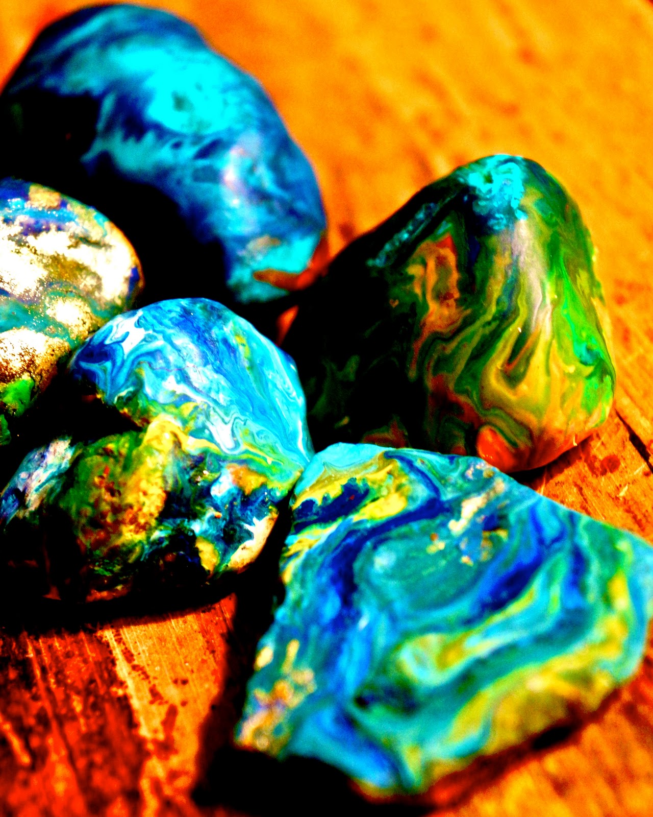
I love melted rocks. Melted rocks rock. I did this art activity with two 6 and 7 year old boys and I think I enjoyed it more than they did (probably because I wouldn’t let them touch the hot rocks…and you know how boys are…they only want to do what they aren’t allowed to do:) ). Something about the simplicity of the activity and watching the crayon melt and mix and swirl with the other colors is so relaxing.
You will need:
smooth rocks- pick out some rocks from your garden (preferably smooth rocks with flattened tops) or you can buy a bag of river rocks from a craft supply store for fairly cheap.
crayons- The Crayola brand work perfectly fine…I had some oil pastels I also tried using…a few of them worked, the more thicker and more expensive they were, the LESS they worked because they didn’t melt as easy and didn’t mix with the other crayons. ALTHOUGH, saying that, one gold oil pastel I had from Blicks art store turned out to be the best. So, try a few different types and experiment.
an oven- or access to one.
An oven mitts (those babies come out of the oven hot)
Foil paper
a large (and preferably old and well used) baking tray
Instructions:
Pre-heat the oven to 350 degrees Farenheit
Wash off and dry the rocks if you grabbed them from the garden
Peel the paper off the crayons you want to use
Put foil paper on the oven tray (to keep any melted crayons from getting on the tray)
Place the rocks on the tray and put them in the oven for at least 15 minutes (the hotter they are the better)
Take the rocks out using the oven mitt (if you are doing this with children make sure to warn them NOT to place their hands directly onto the rock because they will born themselves) and place them on paper plates or foil sheets
Put the crayon onto the surface of the rock and push down firmly for a few moments. Use several different colors to get a colorful effect.


